Final Outcome.
I like this poster, i would say its fun and eye catching, i tried to create a vibe of warmth i used sun rays to do this, i like the texture of the letters Green this was an idea from my artist research. it is very clear to read and understand, the simple message and an be seen from a far.
I would say the font of the leaflet is nicely done, i tried to line up al text and pictures so they look professional. i used shades of green to produce speech boxed because the colure fits in with the nature theme. i like the white space in the front cover, but i would day it may not be eye catching if placed on a stand.
I chose to use a black background as it lifts the other colours up from the page, i think the leaflet meets its target audience and shows clear information and understanding of the matters of conservation and endangered species. i have tried to make the leaflet interactive by adding small guessing games. i understand that the illustration of the zebra done not connect with the matters in the UK, i chose to add it as art work.
Evedience of CAD
I uses Adobe illustrator and InDesgin to desgin my leaflet.
I started with the back add in my infmatin amd chose pictures. I used the blue to like in withmy zebra wxpermation and to make it flow.
The front is simple but i used a bright blue to make it bold.
Using the box tool on InDesgin i was able to lay out my desgin to make it line up. Ilike how the white is easy to read on the blue
Research collected information
The red squirrel’s nemesis is the North American gray squirrel, which is a carrier of a viral disease called “squirrel pox.” While gray squirrels are resistant to the virus’s ravages, the native red squirrels die from it.140,000 red squirrels left in
Great BritainRed Squirrel
An endangered species
is one whose numbers
are so small &
at risk of extinction.
what can adults do?
what can children do?
planting vegetation in your yard.
Minimize use of herbicides
and pesticides.
Recycle & slow down when driving.Build a birdfeeder and establish a
birdbath for the neighborhood birds.
Plant a tree and build a birdhouse in
your backyard.
Ask your parents not to use harmful
chemicals in your garden or home.
Layouts
First i made small layouts to show where my images and titles may go, this also gave me an idea how my pages would like.
Using the right size i went into more detail focusing on my text and information. and where it may go. This was my inside layout. i chose to use my experimentation on a double page because, this will be eye catching and it links back to by research where i looked at brochures that used illustrations and the illustrations on my posters research.
i took this idea and made changes because i felt i could improve it.
The picture below is the final layout i want to use and mac up. I like the white used and the making sure everything is lined up.
Research on brochures
To gather more information i looked at brochures and started to draw up different types of sizes and.
Woburn Safari Park This leaflet looks professional. they used their own images and the font is well lined up.
i like how the they used the same type and colours and it runs along the hole leaflet.
Birds of Prey & Conservation Center I think this leaflet is very effective on reaching their target audience the layout free flowing and the colours are primary based. i like the illustrations they use to attract children.
The Anglian Wolf Society This nose not use a range of colurs have been used but, but an interesting use of green to relate to nature.
I looked at different type of leaflets ans sizes to get an idea of what might work best. i choose to use a three page spreed to show my information and images to promote Conservation and endangered species
experimentation
This was inspired by the research on the WWF poster with the zebra, this was created on Adobe illustrator using a bamoo drawing tablet and the Pen tool. I like how the white stands out from the black background and the pink and blue are bold and eye catching.

This illustration is was inspired again by the last wwf poster that uses the silhouettes of the aquatic animals.
I chose to use these colours so it would stand out and would be fun for children.
Research
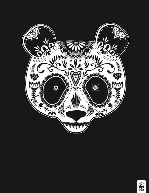
All the advertisement below has used cleaver and creative illustration to give out information that support their cause,

This stamp has a small area to work with but the message is still clear. the way the artist adds shadow to the tiger draws me to read the body copy. This also adds depth to the illustration. the colours used are very calm and is sensible for the stamp.

At first i did not see the illustration, but you notice that it is a gorilla, the artist used dirt, using mixed media may create more depth. the foot print left bleeding over the page creates an interesting view, makes you think why.

As serious as the point of advertising, i like the fact that the poster uses quirkiness, their is no body copy needed ad the message is clear and strong.

I like the simpleness of this poster, the silhouette images of animals are used effectively against the line drawing of the ship.


.jpg)